

A good stock chart should do more than show whether a share price went up or down.
You may want to compare a stock against another company, examine its performance over different periods, switch between line and candlestick charts, add moving averages, customise the appearance, or download the finished chart for research, presentations, or your own analysis.
The problem is that many stock charting platforms either restrict customisation, place useful features behind a subscription, or make it unnecessarily difficult to export a clean, high-resolution chart.
The TWSI Free Stock Chart Builder is designed to make this process simpler. It is a free stock chart builder that lets you create, customise, compare, and download stock price charts directly in your browser. So, in short, our Stock Chart Builder helps you create stock chart online (for FREE!) and lets you download it in 4K (and in any format you like!)
And this guide explains how to use it to its best.
How to Use a Free Stock Chart Builder
Create a Stock Price Chart Online
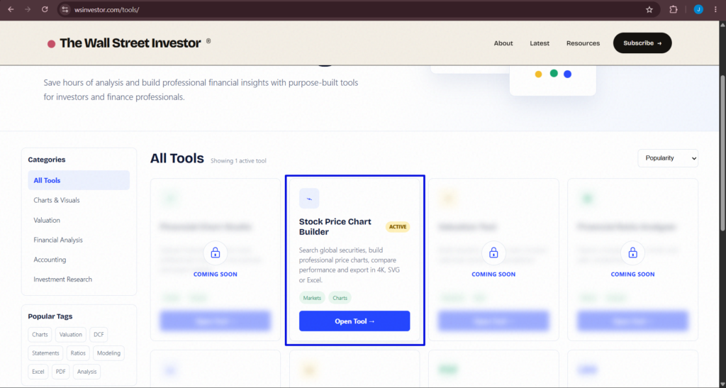
Creating a stock price chart is as easy as scrolling “Instagram”! Just open the TWSI Stock Chart Builder. (from the TOOLS sections)
Use the search bar to enter the stock, ETF, index or ticker symbol you want to analyse. For example, entering AAPL will load Apple Inc. and its available market data.
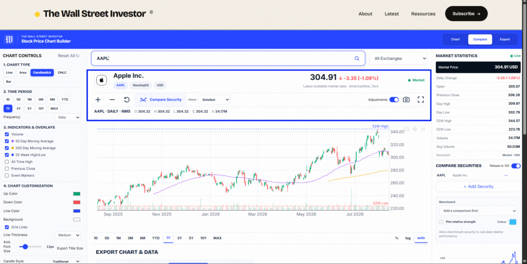
Once the security is loaded, the chart displays its historical price movement along with information such as its market price, daily change, trading range and volume where available. You can then begin changing the chart according to what you want to analyse. Here are the simple steps.
1. Choose Your Stock Chart Type
Different chart types are useful for different purposes. The chart builder allows you to switch between several formats, including:
- Line Chart — useful for quickly understanding the direction of a stock price over time.
- Area Chart — similar to a line chart but with the area beneath the price series filled for stronger visual emphasis.
- Candlestick Chart — displays the open, high, low and close for each trading period.
- OHLC Chart — another way of visualising opening, high, low and closing prices.
- Bar Chart — useful when you prefer a more traditional price-bar presentation.
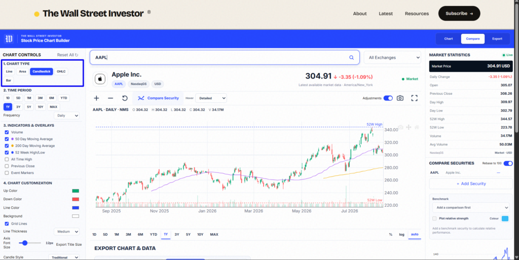
For a simple long-term stock performance chart, a line chart is usually sufficient. For analysing individual trading periods and price behaviour, candlestick or OHLC charts provide considerably more information.
2. Select the Time Period
Next, choose how much price history you want the chart to display. Depending on the available data, you can examine periods ranging from short-term price movements to multi-year historical performance.
For example, you might use:
1. 1 month to examine recent price behaviour.
2. 1 year to understand how the stock has performed over a full market cycle.
3. 5 or 10 years to study long-term price performance and business compounding.
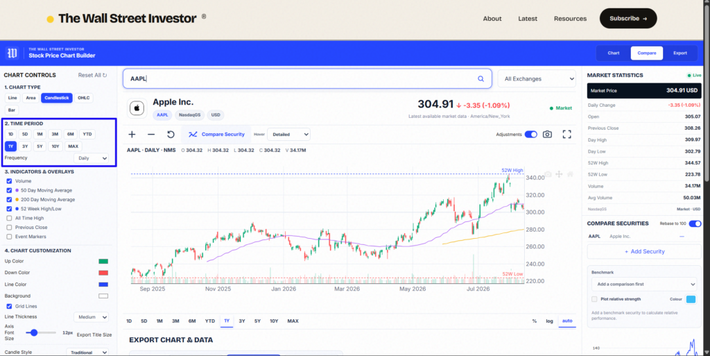
You can also adjust the data frequency where available. The appropriate period depends on the question you are trying to answer. A short-term trader and a long-term investor will naturally look at very different charts.
3. Add Moving Averages and Chart Overlays
Raw price movement is only one part of a chart. You can add simple indicators and overlays to provide additional context, including moving averages and trading volume.
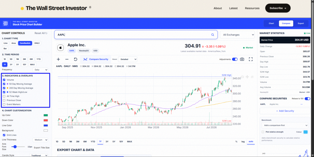
For example, a 50-day moving average helps smooth shorter-term price movements, while a 200-day moving average provides a much longer view of the prevailing price trend. Volume can also help you see how much trading activity occurred during different periods.
The objective is not to add every available indicator. A chart becomes less useful when so much information is added that the underlying price behaviour becomes difficult to see. Use only the information that helps answer the question you are analysing.
4. Compare Multiple Stocks on One Chart
Sometimes the absolute return of a stock tells only part of the story. Suppose a stock increased 40%. That sounds impressive on its own. But what if another company in the same industry increased 90% over the same period?
A comparison chart provides that missing context. Select Compare Security and add another stock or security to the chart. You can then visualise the performance of multiple securities over the same period.
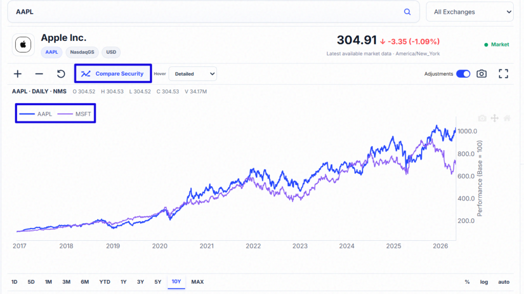
This can be useful for comparisons such as:
– Apple vs Microsoft
– Coca-Cola vs PepsiCo
– A company vs a market index
– Two competitors within the same industry
When appropriate, performance can be rebased to a common starting value so that securities with significantly different share prices can still be meaningfully compared.
5. Analyse Relative Performance
You can go a step further by examining relative strength. Rather than simply plotting two securities beside one another, relative performance helps answer a different question:
Is this stock outperforming or underperforming the security I am comparing it with?
Choose a comparison security as the benchmark and enable the relative-strength option. This creates a relative-performance series alongside the underlying securities.
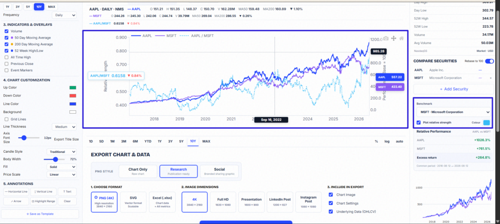
If the relative-strength line rises, the primary security is generally outperforming the selected benchmark over that period. If it falls, the benchmark is performing better.
This can be particularly useful when comparing a company with a competitor, industry benchmark or broader market index.
6. Customise the Stock Chart
A chart used for quick analysis does not necessarily need to look the same as one being prepared for a presentation, article or investment report. The chart builder therefore provides visual customisation options.
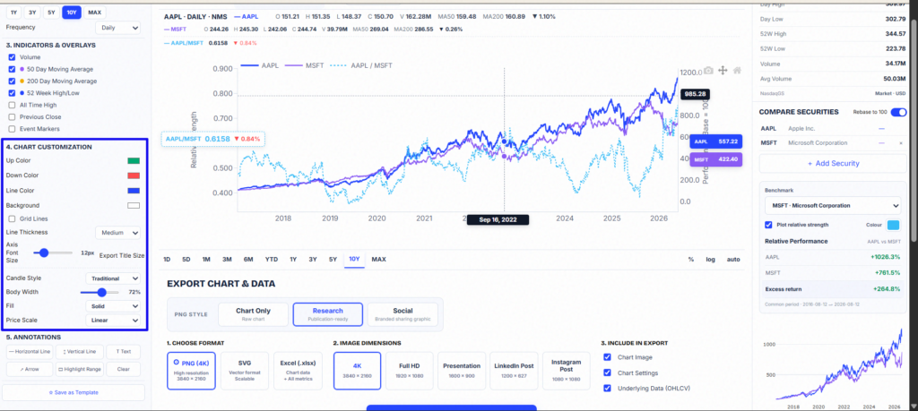
Depending on the selected chart type, you can adjust elements such as:
- Chart and candle colours
- Line appearance
- Background
- Grid lines
- Line thickness
- Axis font size
- Candle style
- Chart annotations
This means you can build a relatively minimal chart for analysis or a more presentation-ready chart for publishing.
7. Add Annotations
Sometimes you need to communicate something on the chart rather than merely show the price series. Annotations allow important periods or levels to be highlighted directly. You can add elements such as horizontal lines, vertical lines, text, arrows, and highlighted ranges.
For example, you might mark:
- An earnings announcement
- A major acquisition
- A market crash
- An important price level
- The beginning of a specific analysis period
Annotations are especially useful when a chart is being included in an investment article, research note, or presentation because they help the reader understand exactly what you want them to notice.
8. Download Your Stock Chart
Once the chart looks the way you want, open the Export section. You can then configure the chart for download. Depending on the export option selected, the downloaded output can include the chart itself as well as supporting information.
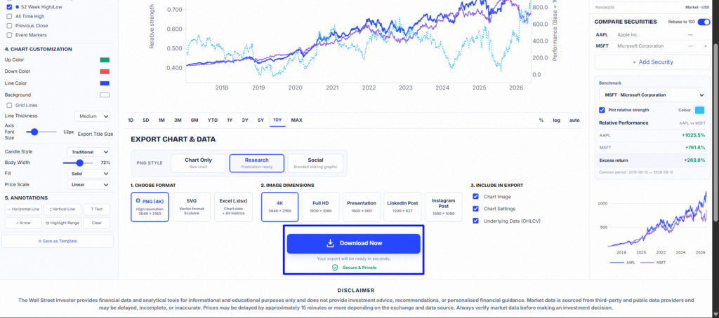
This makes it possible to create a chart in your browser and use the finished output elsewhere without taking screenshots or manually rebuilding it in another application.
For a clean visual, select the Chart Only export option. For a more research-oriented output, choose an export format that includes additional context around the chart.
9. Download a High-Resolution Stock Chart
Image quality matters when a chart is going into a report, presentation, article, or social-media graphic. Instead of relying on a low-resolution screenshot, select the appropriate image dimensions before downloading the chart.
Higher-resolution exports are particularly useful for:
- Investment research
- Financial presentations
- Articles and newsletters
- Educational material
- Social-media graphics
- Company analysis
- Personal investment records
The objective is to produce a chart that remains clear when displayed on a larger screen or incorporated into another document.
What Can You Use the Free Stock Chart Maker For?
The Stock Chart Builder or Stock Price Chart Builder can be useful to investors, analysts, students, writers, and anyone who needs to visualise market-price data. For example, you can use it to:
1. Create historical stock price charts to examine how a company’s share price has developed over time.
2. Compare stocks to see how different companies performed during the same period.
3. Visualise long-term returns when studying businesses that have compounded shareholder value.
4. Create charts for investment research without manually rebuilding price histories in spreadsheets.
5. Export stock charts for presentations when you need a clean visual rather than a screenshot of an entire finance website.
6. Create charts for articles and newsletters when discussing a company’s historical market performance.
The same underlying chart can therefore be customised for very different purposes.
What Makes a Useful Stock Chart?
More data does not automatically produce a better chart. A useful financial chart should make its central message obvious.
If you are analysing long-term performance, you may only need the stock price, a relevant benchmark and a sufficiently long time period. If you are studying price behaviour, candlesticks, volume and moving averages may provide more useful information. If you are communicating an investment idea, annotations may matter more than additional technical indicators.
Before creating the chart, ask: What exactly am I trying to understand or communicate?
Then add only the information necessary to answer that question. That usually produces a much better chart than filling the screen with indicators.
Create Your Own Stock Chart for Free
You do not need complicated charting software simply to create, customise and export a professional stock price chart.
With the TWSI Free Stock Chart Builder, you can search for a security, choose your chart style, adjust the period, add comparisons and overlays, customise the visual appearance and download the finished chart.
Frequently Asked Questions (FAQs)
What is a free stock chart builder?
A free stock chart builder is an online tool that lets you create and customise stock price charts without paying for charting software. The TWSI Stock Chart Builder allows users to visualise historical stock prices, choose different chart styles, compare securities, add indicators and download customised charts for free.
How can I create a stock price chart for free?
You can create a stock price chart for free with the TWSI Stock Chart Builder. Search for a stock or supported security, choose a time period and frequency, select a chart type such as line or candlestick, and customise the chart using colours, moving averages, volume and other settings. You can then export the finished stock chart directly from the builder.
Can I download stock charts for free?
Yes. The TWSI Stock Chart Builder lets you create and download stock charts for free. You can customise the chart before exporting it, making the downloaded charts useful for investment research, financial presentations, articles, newsletters, educational content and personal analysis.
Can I compare multiple stocks using the free stock chart builder?
Yes. You can use the free stock chart builder to compare multiple securities on the same chart. This makes it easier to analyse how different stocks performed over the same period. You can also use performance comparisons and relative-strength analysis to identify whether one security has outperformed or underperformed another.
What types of charts can I create with the TWSI Stock Chart Builder?
The TWSI Stock Chart Builder supports multiple stock chart styles, including line, area, candlestick, OHLC and bar charts. You can also customise chart colours, time periods, frequency, moving averages, volume, annotations, price scales and other visual settings before downloading your chart.
DISCLAIMER: The Wall Street Investor provides financial data and analytical tools for informational and educational purposes only and does not provide investment advice, recommendations or personalised financial guidance. Market data may be sourced from third-party and public data providers and may be delayed, incomplete, or inaccurate. Always verify market data before making an investment decision.
Leave a Reply